Webflow
From $99
Stillness
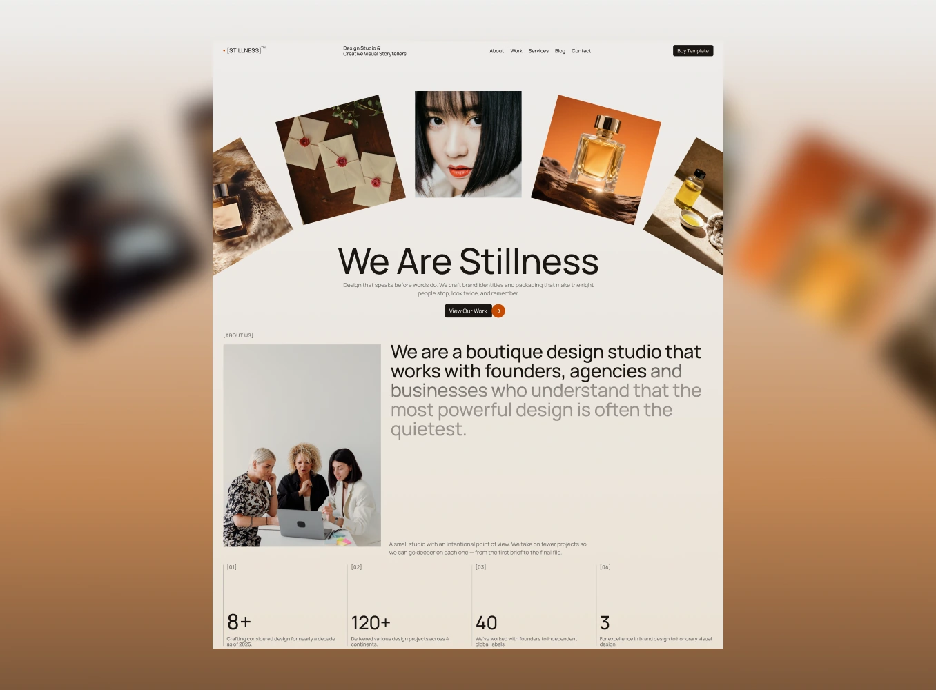
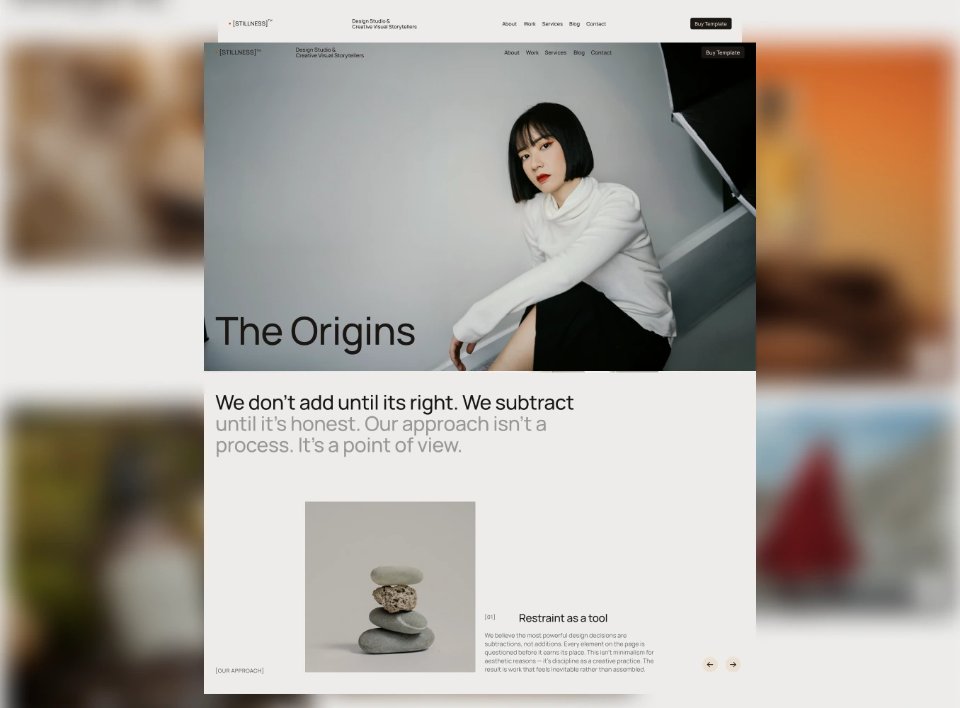
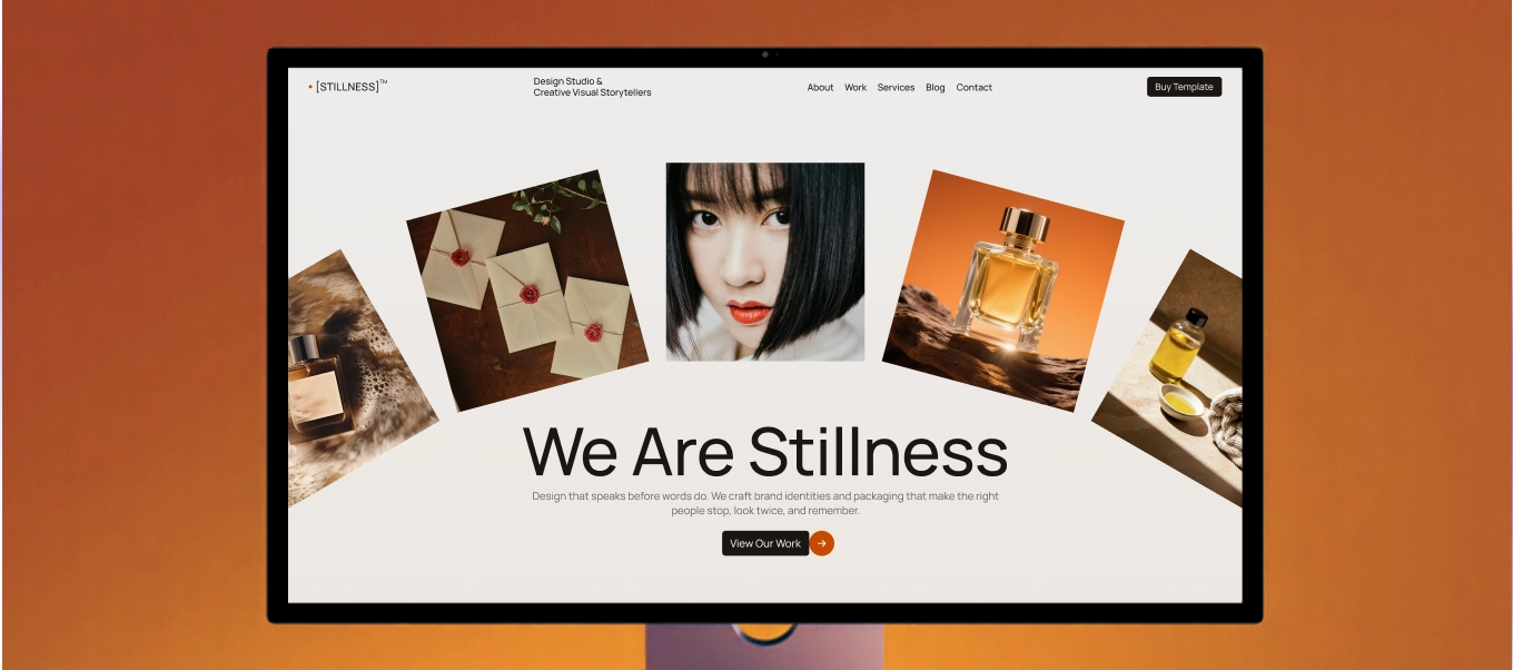
Creative Agency & Design Portfolio Webflow template
You can spend three hours moving a headline 4px to the left and still not be sure if it's the right decision. This is what happens when you're building your Creative Agency or Design Portfolio site, where you're both the designer and the client at the same time. Everything feels wrong, and you start becoming your own worst enemy.
You might even ask yourself the most controversial design question of all: how do I make the logo pop?
I once spent an entire evening deciding between two nearly identical shades of dark grey for a hero section, not because a client asked for it (hint: I was the client), but because I could see the difference and couldn't un-see it. By the time I picked one, I'd forgotten what I was actually trying to say with the page.
Luckily, you're on this site now which means I've already chosen the color and fought that battle to forge this guide which outlines what creative agency and design portfolio sites actually need when starting out and look incredible. It is also the reason why I built templates at Guilty as Foxx. It was to solve this for new designers, or designers who want to revamp their current site. Real people who want to look like a million bucks without losing their time to it when that time should be going towards finding their next client.
Here's what actually needs to be handled for you, not left as one more decision you'll agonize over.
If you're a visual designer, you know exactly how much padding looks "off", which means you'll notice it forever if it's wrong, and you'll never stop touching it if it's not locked in. A template built with a real spacing system (consistent vertical rhythm, deliberate section breathing room) means you're not the one deciding if 64px or 72px is correct at 11pm. It's already set up for you.
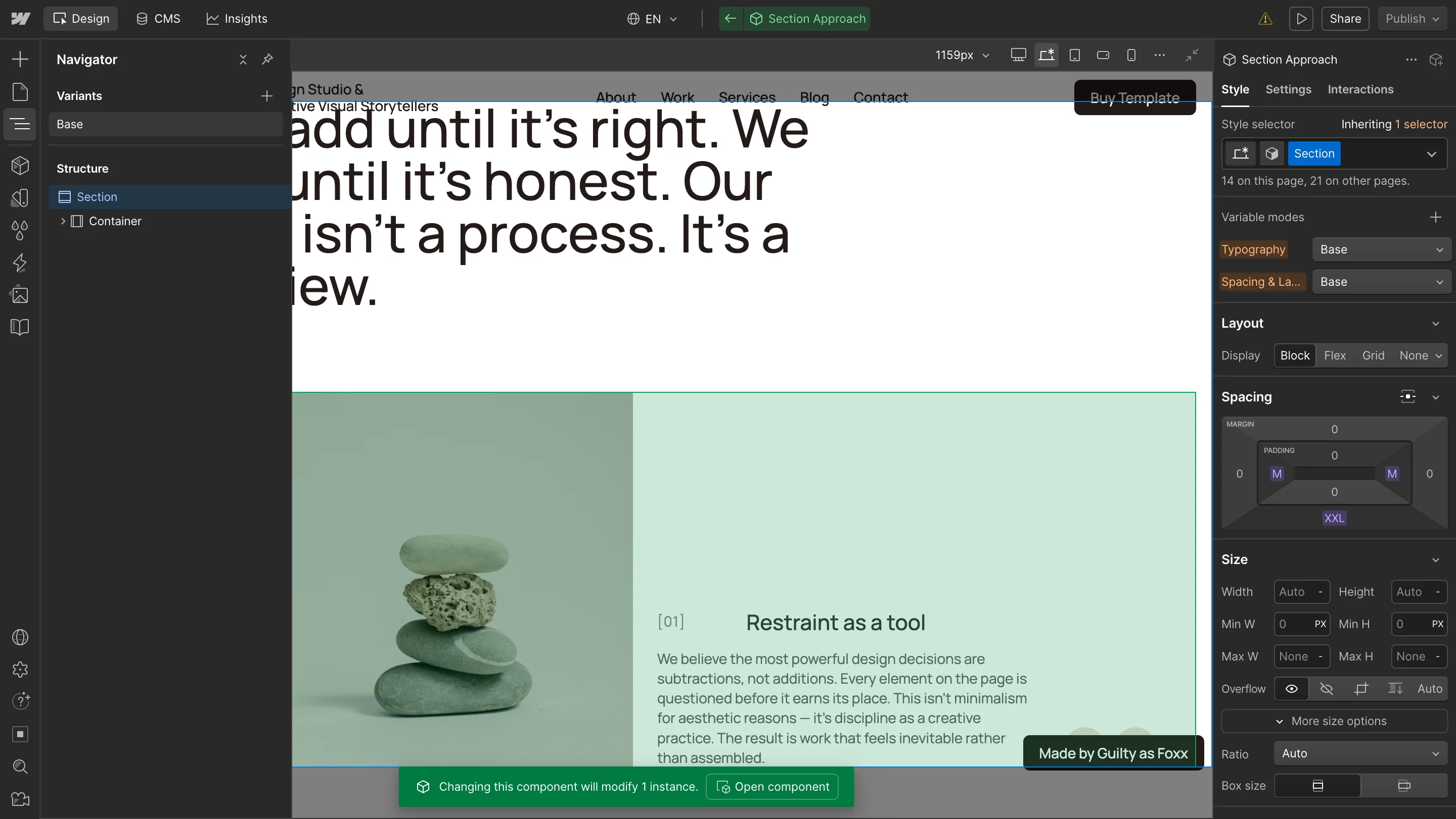
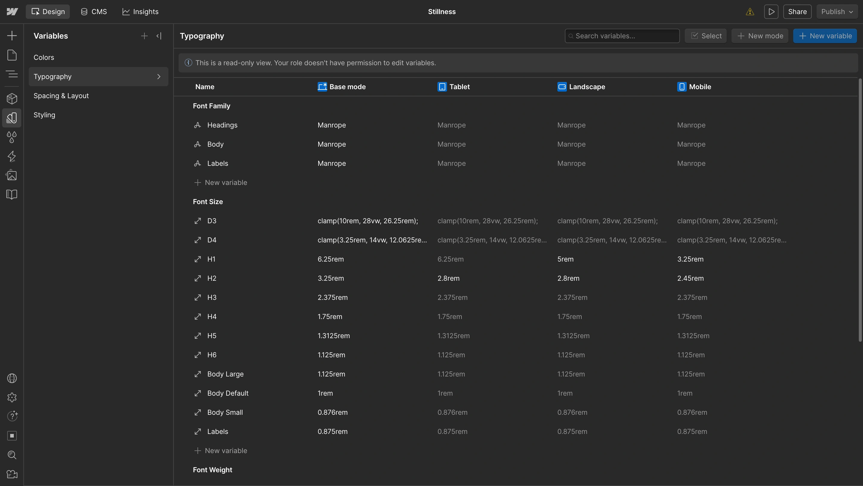
A great template is one which takes advantage of the Variable system and sets up spacing, color palette, typography and other styling. Here's an example from our Stillness template below.
When you're building your own site, every element is a decision you have to justify to yourself with no outside eyes to say "ship it." A template built around a clear structural logic with educated reasoning behind each section means you spend time filling in content and not re-litigating layout decisions.
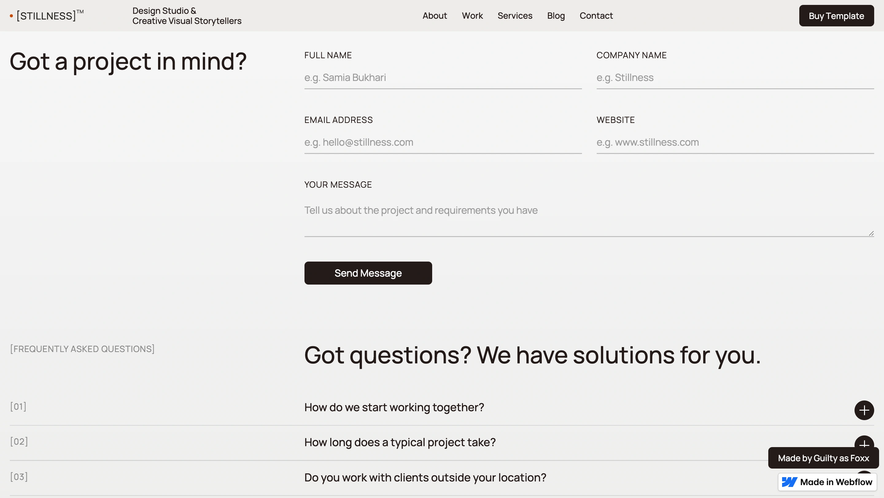
For example, having a form sit right next to FAQs is a great UX strategy as it reduces buyer's decision making and can increase chances of them contacting you for the right inquiry. This great first impression can last throughout the process.
A good template doesn't just save you from figuring out what pages or sections to have, it makes the accessibility, performance, and responsiveness decisions for you too. The stuff that actually matters weighs as heavy as visuals. For example:
One honest caveat worth knowing: every template on Webflow Marketplace scores lower on SEO by design. Webflow requires a line of code that blocks Google's search crawling until you actually own the site. Remove that one line after purchase, and it jumps to an easy 90+. Our Focused template's PageSpeed result below reflects exactly that.

HOT TIP: After purchasing a template, remove the line of code from every page. It will start with "<meta name..." and will be located under Page Setting -> Custom Code -> Inside <head> tag.
Most templates give you animation as raw material, like a scroll trigger here, a fade there, and leave the timing, easing, and stagger up to you. For someone who can feel when an ease curve is 0.1 seconds too slow, that's an invitation to disappear into ScrollTrigger settings for an afternoon.
Take for example our template called Stillness. Its motion is tuned already with considered pacing for all user types. You can also adjust these if you like via detailed Instructions page. However, the animation is created in a way that elevates the visual elements and creates a harmonious journey in each section.
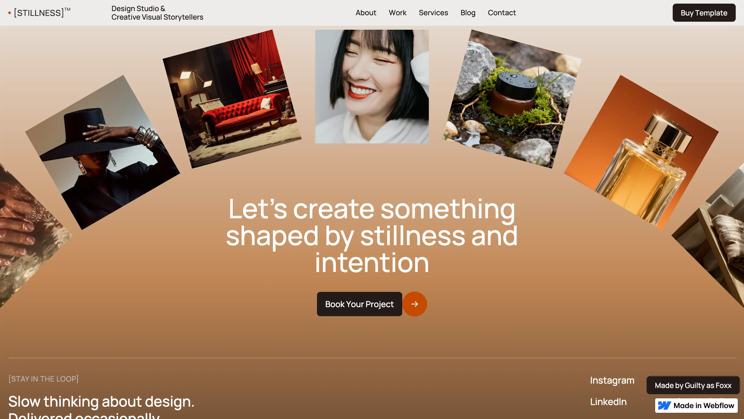
For example, the footer section has a fan animation which consists of project images with the founder image in the middle with an inviting call to action.
Most templates leave type scale as an afterthought, like default sizes and default pairings, which for a brand designer becomes another rabbit hole. A template with a thoughtful type system already created means the hardest typographic decisions (hierarchy, contrast, pairing) are done, so you're choosing your actual brand voice, not testing Söhne against General Sans for the ninth time.
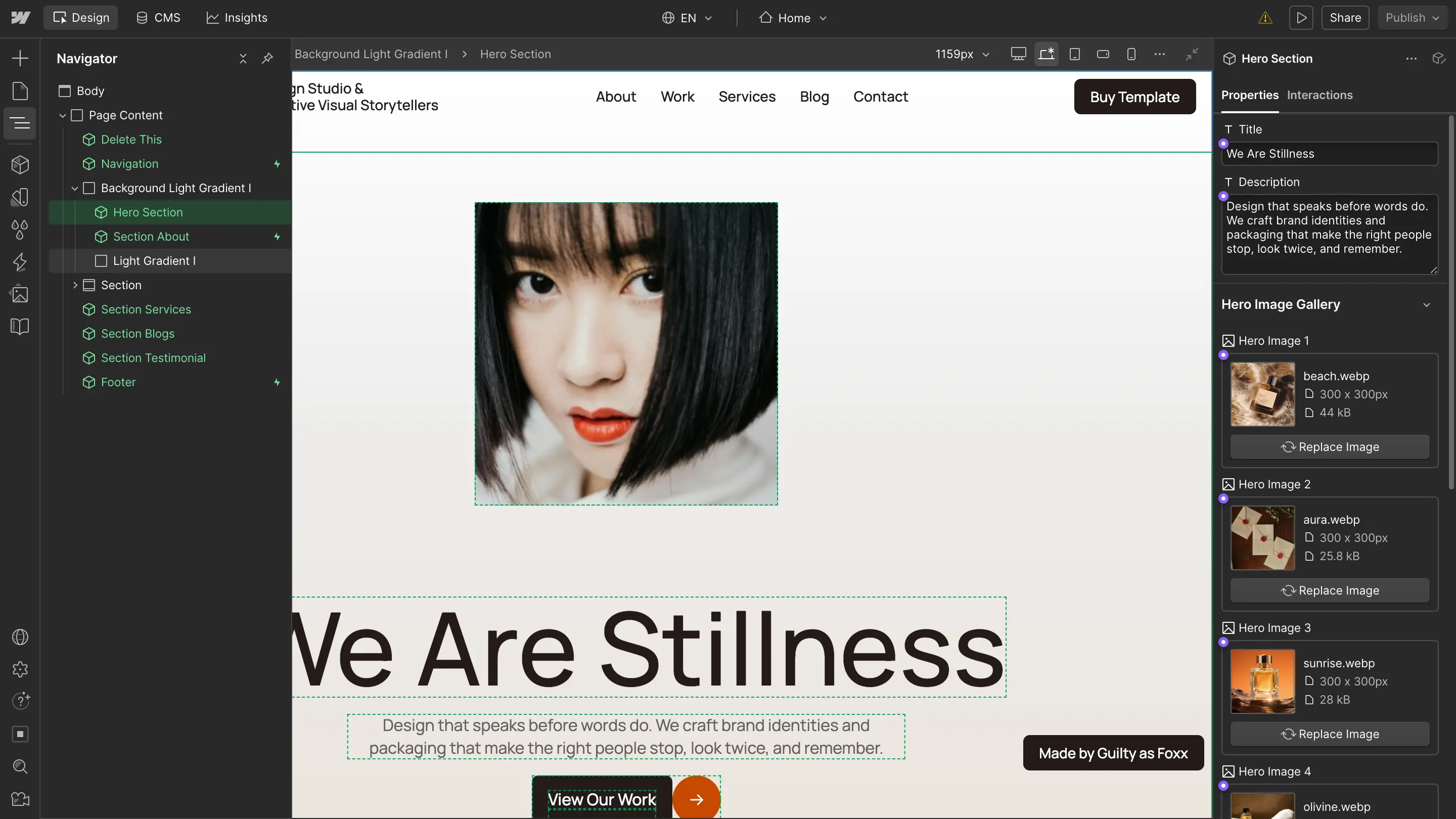
The instinct to "just fix one more thing" gets worse when adding a new project, and it often means re-deciding the whole section's layout. A CMS-driven structure or a component driven structure separates content from design. Simply add a project and the design doesn't change, so there's nothing new to obsess over each time you hit that publish button. This way you can easily manage your projects and adjust for the new years to come.
You don't need more control over your own site. You need less to decide. We build templates at Guilty as Foxx with the intention that the visual instincts you'd normally spend hours second-guessing are already locked in, which means the only thing left to do is drop in your work and ship it.
Creative Agency & Design Portfolio Webflow template
Your brand deserves clarity, impact, and a Webflow website that actually works for you. Let’s make it happen.